Hello everyone and welcome to the first installment of Getting Custom. Getting Custom is about players creating homebrew Magic cards. I hope that I may be able to write an article each week on certain card designs. I even hope to be able to find some other custom card creators to help us through the design process.
So as I have told before, I surf the forums at MTGSalvation quite a bit. I am know to that community as 'jfdep'. I have had quite a few comments over the past few years on my games that I create for the forum games. In fact, it was because of those first comments that I went on and developed my own Magic Block called 'Falling Star', but more on that later in upcoming Getting Custom.
Recently, I came across a forum game called "The Fantasmigorical Cube Creation Contest!". The user is putting together a Cube of custom designed magic cards, so I thought that maybe I should give it a try.
The stipulations was the following:
- Had to be an artifact or land card
- Had to accelerate mana generation at the cost of another resource
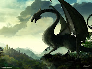
Sounded easy enough. I sat and looked through all the art I have collected over the past few years trying to find something that make for a good land or artifact. At the time this article was being made, I have 3,194 image files in my Magic art folder and I continue to obtain more. As I was scrolling, I came across this piece of art and knew that I had to create a land around this piece. Take a look.

Just beautiful isn't it? I was very well done. The artist is know on DeviantART as Angela-T. Many of her works are beautiful and very well done. I would like to thank her for the art that inspired me to create this card.

Very elegant and simple. One user on the forums described it like this.
I like this card so much. Terrific name. Terrific concept. Terrific playstyle. Terrific flavor text, and terrific render. I would love to see a cycle of these, each with color related drawbacks. -- Alabran
I was happy to see that others liked my land card, and Alabran's comment made me feel like I wanted to continue the cycle. Now, this is where the work starts. How do I make a cycle of these lands that has appropriate backdraw from each with still being balanced?
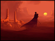
Again, I turn to my Folder-O-Art and looked for some art for the next color pairing which was going to be green, white, and blue. About three quarters of the way down I find this little piece of art. Looks fantastic and I thought captured white rather well.

So, I had the art now what? Well, that was simple, add all the needed text. The hard part was the drawback. So the point of this cycle of lands is to help the opponent out when you help yourself. The more opponents you have that worse it is for you to use it. The Grove's primary color was green and that gave the opponent life. I didn't want to give this one life gain, since I wanted them all to have different effects. Then it dawned on me. White does like to exile cards, but how many cards is enough to exile. Again, I turned to the first card. The more players the more unfair it gets. The final result of the card looked like this.

It took awhile, but I was able to create a whole cycle. Each has their own unique drawback that is indeed color appropriate. Take a look for yourselves.
Color Shard: White/Blue/Black

Color Shard: Blue/Black/Red

Color Shard: Black/Red/Green
So, I think that is enough of my talk for now. I would like to know what you think about these lands. But until next time, this is Deppe passing the turn.


